• ! ! ! IMPORTANT MESSAGE ! ! !

    Discussions about police investigations

    In light of recent developments about a player from Premier League being arrested and until there is an official announcement, ALL users should refrain from discussing or speculating about situations around personal off-pitch matters related to any Arsenal player. This is to protect you and the forum.

    Users who disregard this reminder will be issued warnings and their posts will get deleted from public.

Arsenal agree kit deal with Adidas

dashsnow17

Doesn’t Rate Any Of Our Attackers
Trusted ⭐
The club should really look into updating the badge, the current version is just so cartoonish and tacky. Just as simple cannon would be so much better on the kits.

Liverpool sort of do that. Recently they've not had their actual crest on the shirts, just the simple liver bird with L.F.C underneath.

I always loved this badge, mainly for the kickass gothic font.

TXDip_SxnRnb6qoj6FCuRKjeTk_ZYEBc_KT0-rZOnkQbaHFSXKk6ydCTEXzVuK9vazyfwpkj02GjCT_5TBMscF5WmCbaLHZFlpI41EPY-X9VJrx0YjtWRO-W=s0-d


You could either just have a plain cannon on the shirt, like we used to, or you could easily come up with a modernised version of the old badge. Just take away the aesthetic elements that don't work, like the islington coat of arms and the motto, and then re-work the ones that do, obviously the gothic font, the ermine and the cannon. Could be a fantastic badge.

The club did need to modernise the badge, they just went way too far. I don't think anyone really likes it, but it's been around for so long now that it's become normal.
 

dashsnow17

Doesn’t Rate Any Of Our Attackers
Trusted ⭐
Funnily enough the old art deco crest would be the most suitable for the modern landscape, as it's such a simple design with clean lines. But it doesn't have a cannon, which might be a bit confusing for some people.

Just a nice clean cannon on the shirt, please.

340
 

Riou

In The Winchester, Waiting For This To Blow Over

Country: Northern Ireland

Player:Gabriel
Liverpool sort of do that. Recently they've not had their actual crest on the shirts, just the simple liver bird with L.F.C underneath.

I always loved this badge, mainly for the kickass gothic font.

TXDip_SxnRnb6qoj6FCuRKjeTk_ZYEBc_KT0-rZOnkQbaHFSXKk6ydCTEXzVuK9vazyfwpkj02GjCT_5TBMscF5WmCbaLHZFlpI41EPY-X9VJrx0YjtWRO-W=s0-d


You could either just have a plain cannon on the shirt, like we used to, or you could easily come up with a modernised version of the old badge. Just take away the aesthetic elements that don't work, like the islington coat of arms and the motto, and then re-work the ones that do, obviously the gothic font, the ermine and the cannon. Could be a fantastic badge.

The club did need to modernise the badge, they just went way too far. I don't think anyone really likes it, but it's been around for so long now that it's become normal.

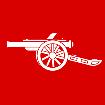
That's definitely the better badge, but I don't mind the current one...only issue I have with the badge we have now, I wish they just used the same cannon as the one above, the cannon now just has lacks something.
 

MikelHadADream

Established Member
Trusted ⭐
Funnily enough the old art deco crest would be the most suitable for the modern landscape, as it's such a simple design with clean lines. But it doesn't have a cannon, which might be a bit confusing for some people.

Just a nice clean cannon on the shirt, please.

340

Yeah this would be so much better, I think simplicity looks so much better on the kit/training gear. I think that's party why Juventus rebranded, the simple J just looks a lot cleaner on their merchandise.

I also think the club would stand to benefit from a crest change purely on the basis that the current badge is associated with failure and calamity lol.
 

MikelHadADream

Established Member
Trusted ⭐
Liverpool sort of do that. Recently they've not had their actual crest on the shirts, just the simple liver bird with L.F.C underneath.

I always loved this badge, mainly for the kickass gothic font.

TXDip_SxnRnb6qoj6FCuRKjeTk_ZYEBc_KT0-rZOnkQbaHFSXKk6ydCTEXzVuK9vazyfwpkj02GjCT_5TBMscF5WmCbaLHZFlpI41EPY-X9VJrx0YjtWRO-W=s0-d


You could either just have a plain cannon on the shirt, like we used to, or you could easily come up with a modernised version of the old badge. Just take away the aesthetic elements that don't work, like the islington coat of arms and the motto, and then re-work the ones that do, obviously the gothic font, the ermine and the cannon. Could be a fantastic badge.

The club did need to modernise the badge, they just went way too far. I don't think anyone really likes it, but it's been around for so long now that it's become normal.

The font on the new trainings kits resembles this. Might see next season that the non premier league font is this gothic one.
 

Furious

Emery Gone, Telly Back On
It's kind of a shame that our Invincible season badge is mainly associated with the stuff that's happened to the club since the stadium move.

The Juventus badge is horrible to me, especially compared with the previous amazing badge they had.

Disagree on the Juve badge. Think it's very modern and looking back now at the old one it really looks out of date. It was part of their rebranding strategy and along with the signing of Ronaldo I think it has deffo had an affect, especially among younger fans and internationally in general.

Think we should mirror what they did, need to rebrand the club, and try to eliminate the damaging image associated with our club.
 

Riou

In The Winchester, Waiting For This To Blow Over

Country: Northern Ireland

Player:Gabriel
Disagree on the Juve badge. Think it's very modern and looking back now at the old one it really looks out of date. It was part of their rebranding strategy and along with the signing of Ronaldo I think it has deffo had an affect, especially among younger fans and internationally in general.

Think we should mirror what they did, need to rebrand the club, and try to eliminate the damaging image associated with our club.

It just looks like an unlicensed PES badge for me :lol:

Maybe it's just me, I am very attached to old school stuff/things I grew up with.
 

Heskey

🌑 🌘🌗🌖🌕🌔🌓🌒
Trusted ⭐
It just looks like an unlicensed PES badge for me :lol:

Maybe it's just me, I am very attached to old school stuff/things I grew up with.
I'm with you on this @Riou.

I actually would go to the extend of saying I hate the new Juve logo. And many other clubs with more "modern" takes on logos (kits too) as well. It seems - in my opinion - that 'modern' often has become an excuse of making something very bland and identity-less. Simple, and marketable seems to be the end all be all, rather than something that's unique and shows some character. I'd any day of the week rather have the logos that all the other clubs in Serie A have.

Nostalgia is also one of the most important things in football in my opinion, the reason we all stick around after decades of mediocre football from our childhood clubs. We don't stick around for the sheer pain - okay, some of us are gluttons for pain - but we stick around because we remember the days we went with our parents to our first game. The day we got our first jersey. Trying to draw our teams logo - and fail miserably everytime because it wasn't just two ****ing lines next to each other(!!!).

Once the logos, names, etc. gets changed, what's there to keep you attached to the clubs anymore.. IMO. football is already at a point where money had had a serious affect on the nostalgia/joy it provided because of how one-sided and dominated most leagues are.

Logos and names are some things where I really appreciate the more archaic designs - especially because most of these 'modern' designers have some styles that I think are more often than not horrible. Just look at kits - how often don't we sit and dream away to the kits of prior decades? :lol:


And another thing I hate while I'm on the subject. Kits, where the front design stops on the back! **** me. Like, there's stripes, or whatever on the front, and then the back is just one color. Nah. **** that.
 

razörist

Soft With The Ladies, Hard With The Mes

Country: Morocco
I'm with you on this @Riou.

Nostalgia is also one of the most important things in football in my opinion, the reason we all stick around after decades of mediocre football from our childhood clubs. We don't stick around for the sheer pain - okay, some of us are gluttons for pain - but we stick around because we remember the days we went with our parents to our first game. The day we got our first jersey. Trying to draw our teams logo - and fail miserably everytime because it wasn't just two ****ing lines next to each other(!!!).
I’m here because I have no other friends
 

dashsnow17

Doesn’t Rate Any Of Our Attackers
Trusted ⭐
Disagree on the Juve badge. Think it's very modern and looking back now at the old one it really looks out of date. It was part of their rebranding strategy and along with the signing of Ronaldo I think it has deffo had an affect, especially among younger fans and internationally in general.

Think we should mirror what they did, need to rebrand the club, and try to eliminate the damaging image associated with our club.

Are they gonna rename the stadium when the naming rights deal expires in 2028 I wonder? That'd be a good time for a rebrand.

Problem is it's been called the Emirates for so long that it's indelibly marked on the public consciousness as the Emirates. Even if they officially changed it to Ashburton Grove or something lots of people would probably still think of it as the Emirates.
 

Latest posts

Top Bottom